Why Microsoft's Media Creation Tool Is a UX Disaster (And How I’d Fix It)

Table of Contents
- Introduction
- So, what exactly has happened, and why was it so frustrating?
- Lessons to learn
- A picture is worth a thousand words
- Why did I write all of this?
- Special thanks to
Introduction
Dear Microsoft people.
I can’t stop being amazed at how well Windows can run a very complicated task, such as a modern 3D AAA videogame, but is unable to properly execute a more mundane routine, like creating a bootable USB flash drive.
Yes, I’m talking about the Media Creation Tool. Recently, I’ve used it. And my experience was so horrible, I was pretty much forced to use a pirate site. Can you imagine that?
So, what exactly has happened, and why was it so frustrating?
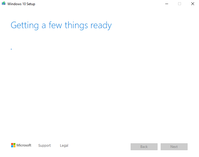
First of all, multiple “Getting a few things ready” screens. What things, guys? Why does it require time? Why don’t you want to be more specific and give the user more info? Why do you hate feedback?
 What is happening here, guys?
 That’s (NOT) a good example of error handling
And more, multiple bugs or bad UX decisions. You’ve downloaded all the data, but the USB drive\SD card\DVD disk contains some errors? You’re done. There is no option (at least what I’ve witnessed with my USB drive) to save your progress, no button “Retry” or “Use another USB\SD card\DVD”. Nope. Close the tool and start again
Do you see what’s wrong with this screen?
I’ll tell you: no “Retry”, no “Choose another disk to store data on” or “Save directly to USB\SD card” in case of bootable media creation. Nah.
When I experienced this and other troubles, I just gave up and went to the pirate torrent site to get the Windows ISO.
Lessons to learn
I got it, Microsoft is a poor company that can’t spend more money on designers and developers, so I’ll help you to form a better view of a future tool, and I’ll do it for free:
- What should we see on the intro screen? Greetings. Obviously, greetings. And the most important info at the moment - the preferred language. Language not only defines what text gonna be written on buttons, but also how these buttons gonna be placed.
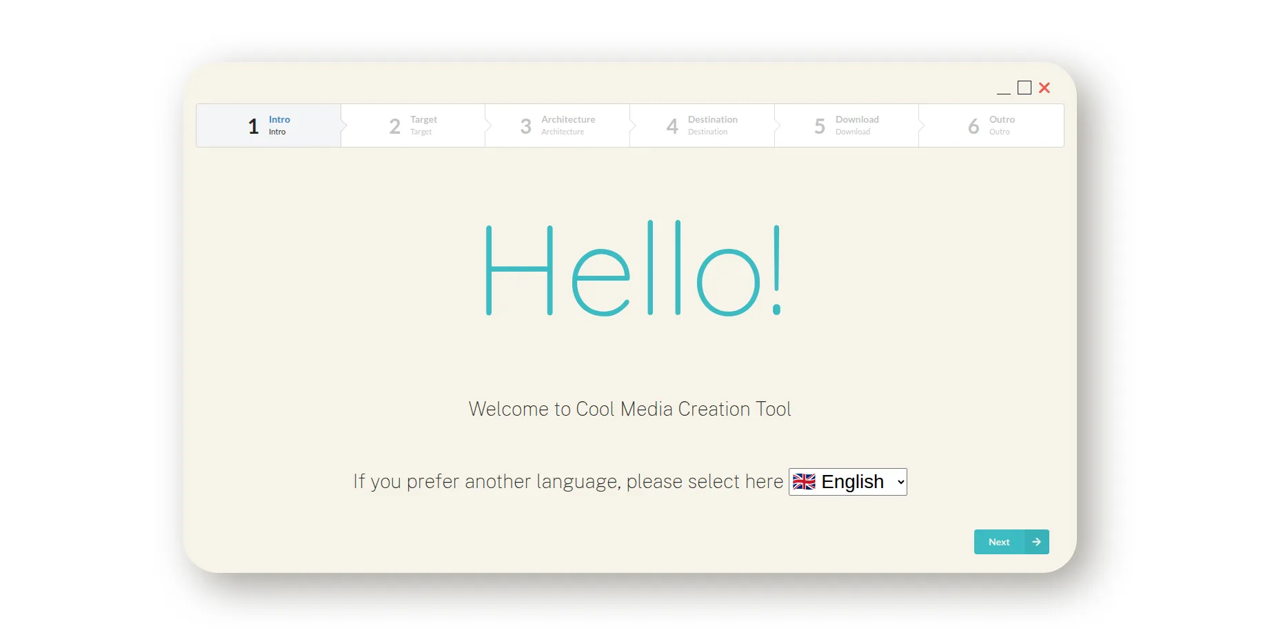 Greetings screen with language selection option
- The second screen is the place to ask the user about intentions: ISO file or bootable media. Also, it’s time for another vital element of the interface that the original Media Creation Tool lacks to show itself - a stepper, or general progress bar. Users should see what steps are awaiting and what steps have been completed.
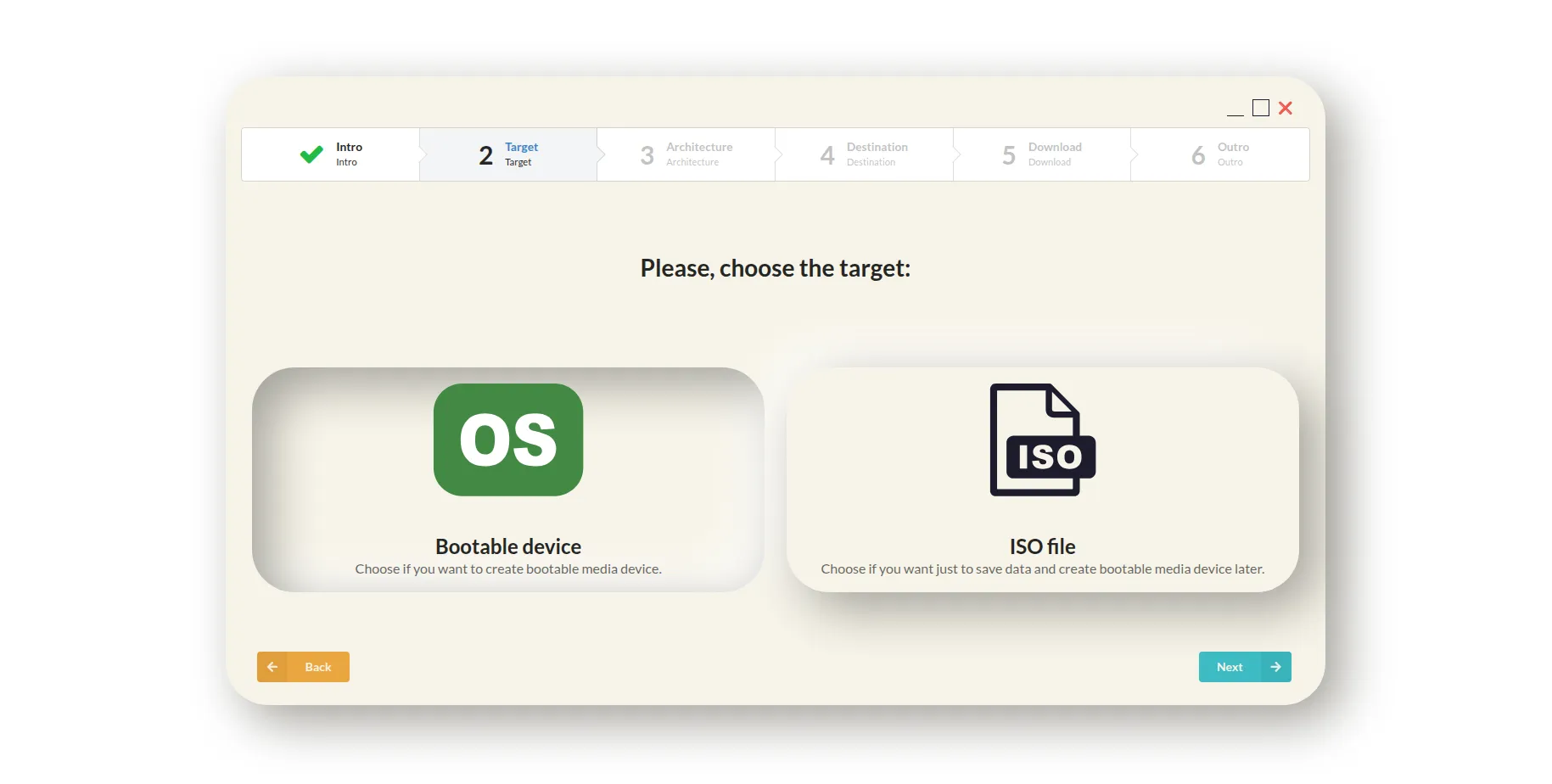 Screen with target selection option
- The third screen is for OS settings - architecture, some advanced tweaks for ARM, etc.
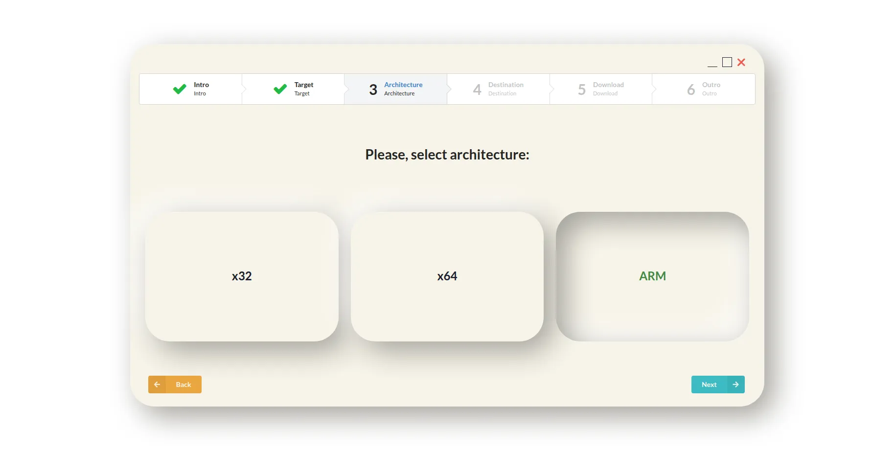 Screen with architecture selection option
- The fourth screen is for the physical destination. Here, the user is choosing where the data gonna be stored. We automatically check if drives\devices have enough space, and unfit ones are marked as disabled in the dropdown/selectable list element. But there should also be a “Refresh” button since users can move or remove unused or unnecessary data on drives or devices, so they could be considered fit for our purpose. More so, there is a place for one interesting hint: we can give users the possibility to save data on media directly. Obviously, in that case, the possibility of errors is gonna be higher than usual because it’s now not only about an internet connection but also a physical connection with an external drive. But there are enough places in the world where the internet connection speed is lower than the USB/SD card writing speed. Note: the destination is a kinda weird word to call it, but…whatever
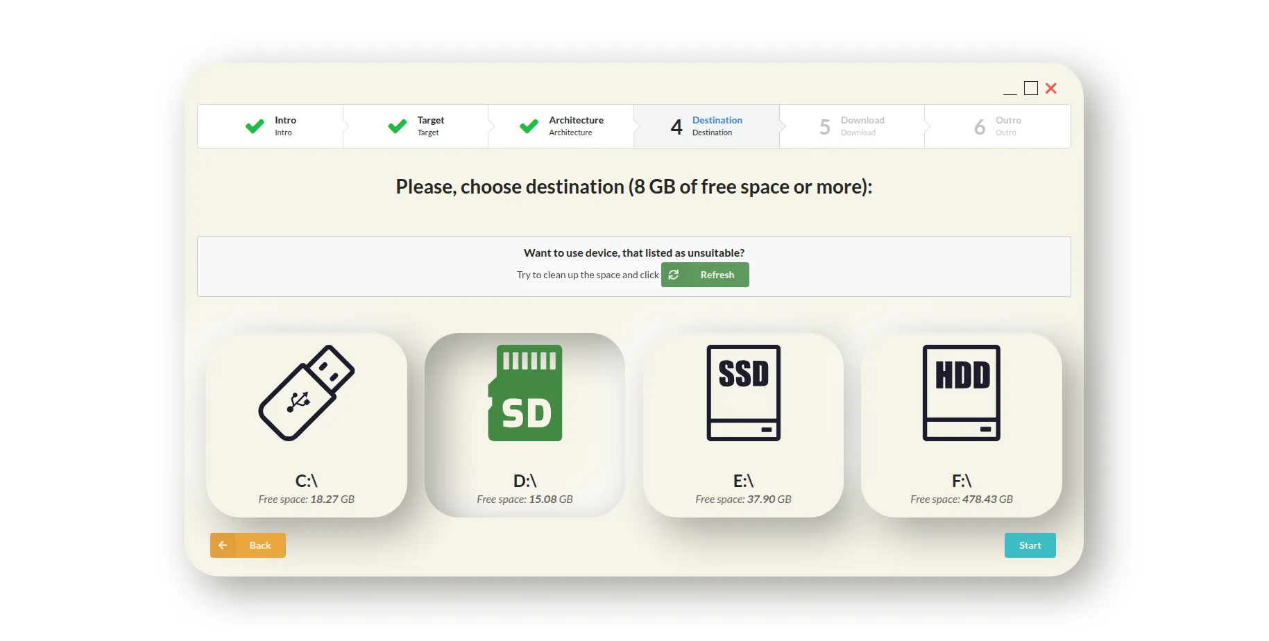 Screen with destination selection option
- The next screen is the downloading screen, which could be divided into three parts: the “Cancel” button, ETA, downloading/writing speed panel, and advertisement panel (because it’s actually a nice place to promote your products, look at the installation tool from GOG.com).
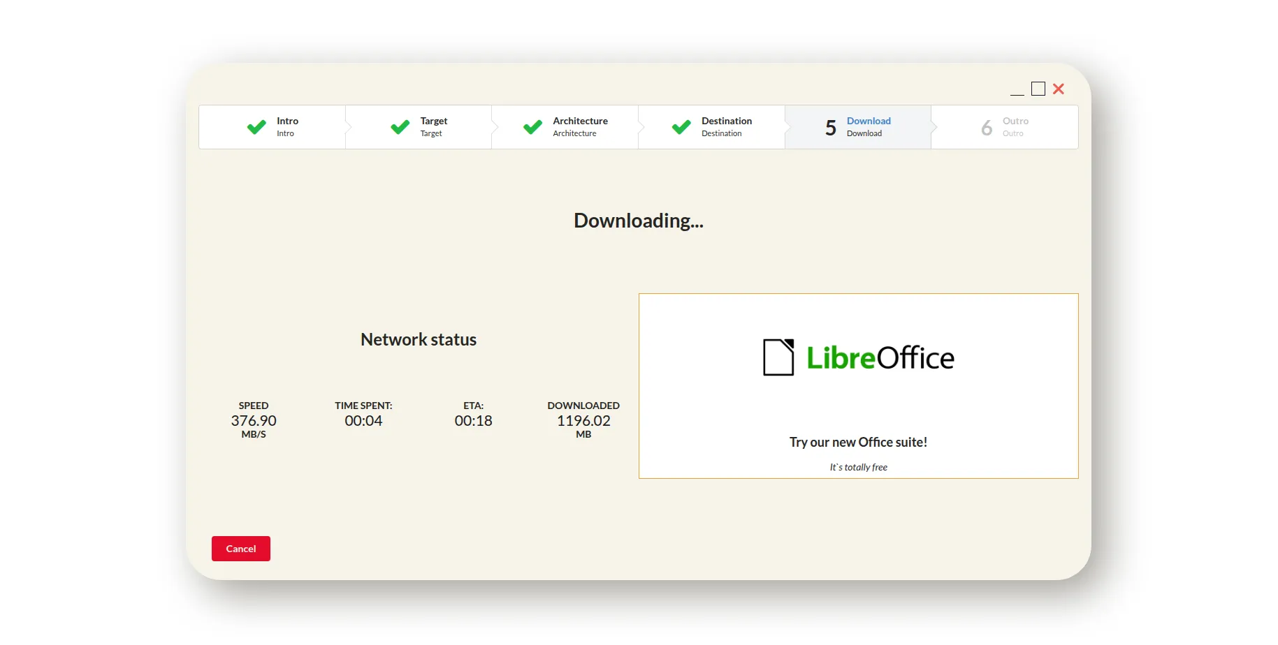 Loading screen with a cancel option
- And here is the outro\finish screen, it’s the place to thank the user for choosing our media creation tool and to place short instructions on where to go if there are some errors with downloaded or written data.
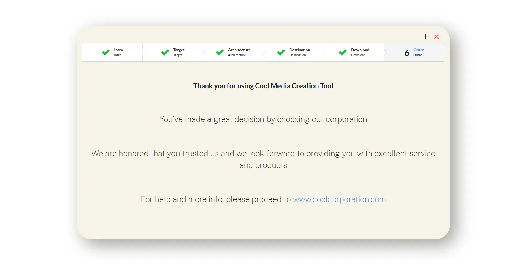 Outro screen
That’s it. We did it, Patric. We’ve built a better Media Creation Tool. However, that’s the simple case. For a more complete solution, we should add to this:
- error handling (when we have a list of pre-defined errors, proper try and catch mechanisms, so we can show what’s actually wrong, not some hex code) and “Retry” button if possible;
- more advanced drive\device handling (for example - automatically format USB flash drive or SD card);
- ability to continue downloading after complete disruption, somewhat torrent-like;
- fetching some needful data in the background without annoying the user;
- etc
A picture is worth a thousand words
So I created a really small React SPA. It can be found here.
It’s a very crude and basic mockup, but I think it could illustrate my points.
Why did I write all of this?
I do not doubt that there wouldn’t be any changes in the Media Creation Tool at all, because Windows 11 is a top priority. But I can only hope that the next instrument for creating a bootable device from Microsoft would be more user-friendly, more advanced, more useful, and provide a better and smoother experience. Because, you know, it’s a shame that such a big corporation cannot build a tool on par with free and open-source utilities, like UNetbootin or Etcher.
Special thanks to:
- https://uxwing.com/ for free icons
- https://neumorphism.io/ for soft UI
- Semantic UI React for CSS
- https://designshack.net/ and https://atlantabrewing.com/ for color palette